
Color as Strategic Communication Tool
Color influences human perception and behavior through psychological, cultural, and physiological mechanisms. In corporate branding, color selection represents strategic decision affecting recognition, emotional response, and behavioral outcomes. For Kenyan businesses, color strategy must navigate universal psychological principles, specific cultural meanings in Kenyan contexts, and industry category conventions that shape expectations.
Research demonstrates color's impact: up to 90% of snap judgments about products can be based on color alone; appropriate color increases brand recognition by 80%; color influences purchase intent and brand perception significantly. These effects operate below conscious awareness, making color strategy particularly powerful precisely because audiences don't critically evaluate color influence.
Universal Color Psychology
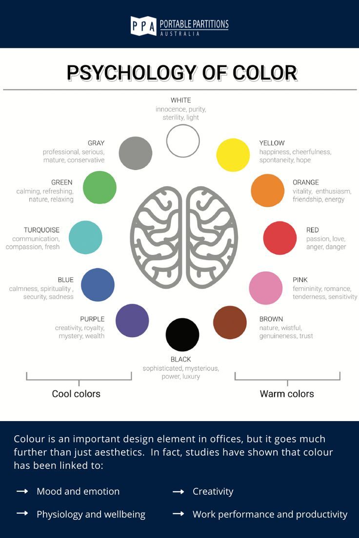
Blue universally conveys trust, stability, and professionalism. Physiologically, blue lowers heart rate and blood pressure, creating calm impression. Financial institutions, technology companies, and healthcare organizations globally leverage blue's credibility associations. Kenyan banks and insurance companies predominantly utilize blue positioning.
Red stimulates energy, urgency, and excitement. Physiologically, red increases heart rate and creates arousal. Retailers use red for sale signage and call-to-action; food brands leverage red's appetite stimulation; entertainment brands use red for excitement associations. However, red can signal danger or aggression requiring careful contextual application.
Green connects to nature, growth, and sustainability. Environmental brands obviously leverage these associations; financial services use green's money connotations; health and wellness brands employ green's natural healing associations. Green's calming effect suits brands seeking approachable, trustworthy positioning.
Yellow communicates optimism, creativity, and warmth. As most visible color in spectrum, yellow attracts attention effectively. However, yellow can signal caution (traffic signs) or cheapness requiring careful quality signaling. Best used as accent or by brands seeking friendly, accessible positioning.
Orange combines red's energy with yellow's optimism, creating friendly, energetic impressions. Less aggressive than red, orange suits brands seeking approachable enthusiasm. Often used for call-to-action and youth-oriented positioning.
Purple historically associated with royalty, luxury, and creativity. Premium brands leverage purple's sophistication; creative industries use purple's imagination associations; spiritual brands employ purple's mystical connotations. Purple's relative rarity in corporate branding creates distinctive presence.
Black signifies sophistication, power, and luxury. Premium brands use black for exclusivity; fashion brands leverage black's elegance; technology brands employ black's sleek modernity. Black can signal heaviness or negativity requiring balancing elements.
White represents purity, simplicity, and cleanliness. Healthcare brands leverage white's sterility; technology brands use white's modern minimalism; lifestyle brands employ white's spacious calm. White requires careful quality execution to avoid appearing cheap or unfinished.
Cultural Color Context in Kenya
Red carries political significance in Kenya through association with major political parties. Corporate brands should navigate these associations carefully—red can signal partisanship unintendedly or create alienation among supporters of other parties. Neutral business applications may prefer alternative energetic colors.
Green holds strong positive associations through connection to agriculture, environment, and Islam. Kenya's agricultural economy and natural beauty make green particularly resonant; Islamic cultural presence reinforces green's positive meanings. Strong choice for brands emphasizing growth, natural qualities, or sustainability.
Black, white, and red together carry national flag associations. While patriotic, this combination can appear overly nationalistic for brands seeking regional or international positioning. Consider whether national identity signaling serves brand objectives.
Gold and earth tones connect to African heritage and premium positioning. These colors can signal cultural pride and luxury simultaneously, differentiating from Western color conventions. Appropriate for brands emphasizing African identity and premium quality.
Color preferences vary across Kenya's diverse communities. What resonates in urban Nairobi may differ from rural preferences; generational differences affect color response; international exposure influences cosmopolitan audiences. Research-based color selection validates assumptions.
Industry Color Conventions and Differentiation
| Industry | Common Colors | Differentiation Opportunities |
|---|---|---|
| Banking/Finance | Blue, green, gold | Purple (innovation), orange (accessibility) |
| Healthcare | Blue, white, green | Warm colors (approachability), purple (specialty) |
| Technology | Blue, black, white | Bright accents (energy), green (sustainability) |
| Agriculture | Green, brown, gold | Blue (technology), modern neutrals |
| Education | Blue, red, green | Purple (excellence), orange (creativity) |
| Energy/Utilities | Blue, green, orange | Purple (innovation), sophisticated neutrals |
| Real Estate | Blue, green, brown | Gold (luxury), black (urban sophistication) |
| Hospitality | Warm tones, gold, red | Cool blues (calm), green (sustainability) |
| Manufacturing | Blue, red, black | Green (sustainability), orange (energy) |
| Professional Services | Blue, black, gray | Accent colors (personality), warm tones |
Category conformity vs. differentiation presents strategic choice. Following category color conventions signals industry membership and meets expectations; differentiating through unexpected colors creates distinctive presence but risks confusion or rejection. New market entrants often benefit from differentiation; established players may prefer conformity.
Color ownership by dominant competitors may preclude effective use. If market leader owns category color, followers appear derivative or weak using similar colors. Alternative color strategies become necessary—either different category colors or multi-color approaches preventing single-color ownership.
Color System Development
Primary brand color anchors identity and should appear in 60-70% of brand applications. This dominant color creates recognition and carries primary psychological load. Selection requires careful consideration of all factors above—psychology, culture, category, competition.
Secondary colors support primary color, adding range and flexibility. Secondary palette might include complementary colors (opposite on color wheel for contrast), analogous colors (adjacent for harmony), or neutral balances. Typically 2-3 secondary colors provide adequate range without fragmentation.
Accent colors provide emphasis for calls-to-action, highlights, and special applications. Bright, energetic colors often serve accent roles regardless of primary palette. Accent usage should be limited (10-20% of applications) to maintain impact.
Neutral colors (grays, beiges, whites, blacks) provide background and balance. These practical colors enable readability, create sophistication, and allow primary colors to command attention. Comprehensive color systems include neutral specifications.
Technical Color Specification
Pantone Matching System (PMS) provides standardized color communication for print applications. Specifying Pantone colors ensures consistency across different printers, materials, and locations. Essential for brand color integrity.
CMYK process color specifications enable four-color printing reproduction. Conversion from Pantone to CMYK requires careful proofing as color shifts occur; some Pantone colors have no accurate CMYK equivalents requiring spot color printing.
RGB and hex specifications serve digital applications. Screen colors differ from print colors—bright, saturated RGB colors often cannot reproduce in print. Digital-first brands must consider print limitations in color selection.
Accessibility standards require sufficient color contrast for readability. WCAG guidelines specify contrast ratios for text and interactive elements; color-blind accessibility requires information not rely solely on color differentiation. Inclusive color design serves all users.
Color Implementation and Management
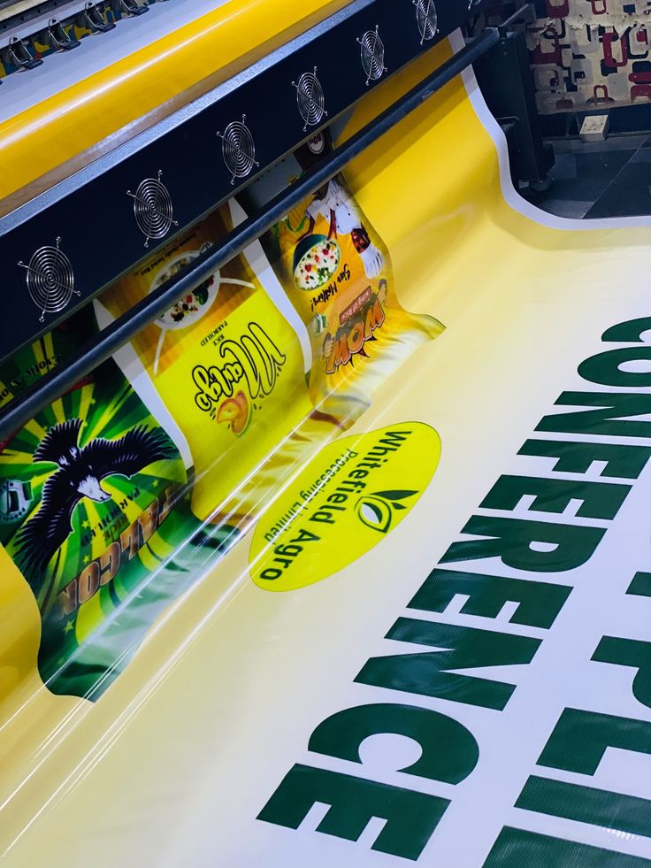
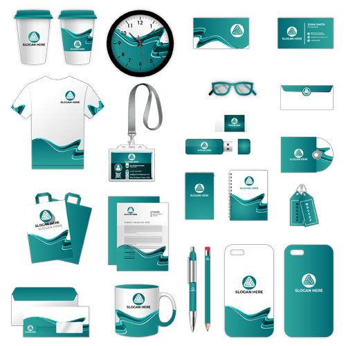
Brand guidelines must specify precise color values across all applications—print, digital, environmental, and product. Inconsistent color application undermines recognition and professionalism. Comprehensive specifications prevent drift.
Color proofing validates reproduction accuracy before production. Monitor calibration, physical proofs, and press checks ensure colors reproduce as specified. Quality control processes catch deviations before full production.
Supplier management ensures color consistency across vendors. All production partners should receive color specifications and demonstrate capability to match them. Regular quality audits maintain standards.
Color evolution may be necessary as brands refresh or market conditions change. Color changes require careful management to maintain recognition while updating perceptions. Gradual evolution often succeeds better than dramatic changes.
Luna Graphics provides color strategy services including color psychology consultation, competitive color analysis, and technical color system development. Our color management expertise ensures your brand colors reproduce accurately across all applications. Contact our design team to discuss strategic color selection for your corporate brand.
Written by Ian Love
Marketing Director
Professional contributor at Luna Graphics specializing in printing and branding solutions.