
The Semiotics of Placement
Logo placement significantly affects brand perception through principles of visual hierarchy, spatial relationships, and cultural reading patterns. Thoughtful positioning enhances visibility and professionalism; careless placement undermines credibility and impact. Understanding placement principles enables strategic implementation that maximizes brand presence.
Logo placement is not merely aesthetic preference but strategic decision affecting: attention capture; relationship with other content; perceived importance; and practical functionality. Each application context requires placement analysis.
Placement Principles
Visual hierarchy determines logo prominence relative to other elements. Primary placement (top, center, large) signals organizational importance; secondary placement supports content; and integrated placement suggests sophistication. Hierarchy should match communication objectives.
Reading patterns affect logo visibility. Top-left placement leverages Western reading pattern (left-to-right, top-to-bottom); centered placement creates formal balance; and bottom placement anchors composition. Consider audience reading habits.
Space and breathing room affect impact. Adequate clear space isolates logo from competing elements; cramped placement reduces prominence; excessive space may disconnect from content. Balance required.
Contextual relationships with other elements create meaning. Logo above headline suggests organizational authority; logo with contact information implies accountability; and repeated placement reinforces recognition. Relationships communicate.
Application-Specific Guidelines
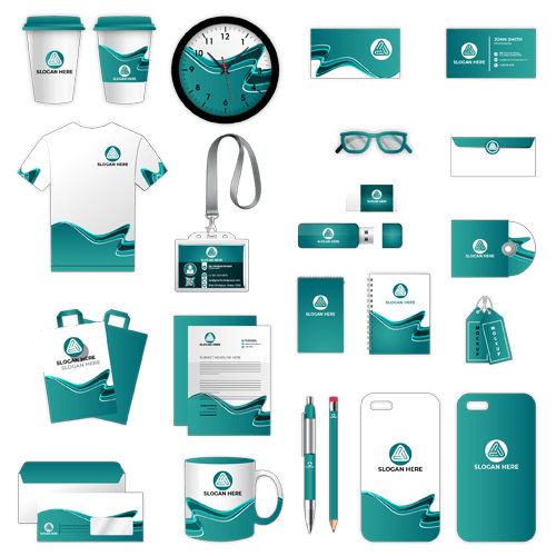
Stationery placement establishes professional standard. Letterhead top placement (centered or left); business card front placement (typically top-left or centered); and envelope positioning. Consistency across stationery suite.
Digital applications require responsive placement. Website header placement (typically top-left); email signature positioning; and social media profile optimization. Digital constraints affecting placement.
Signage placement ensures visibility at distance and angle. Height considerations; sightline analysis; and illumination effects. Environmental factors.
Vehicle placement maximizes mobile visibility. Panel positioning; curve accommodation; and regulatory compliance. Mobile visibility optimization.
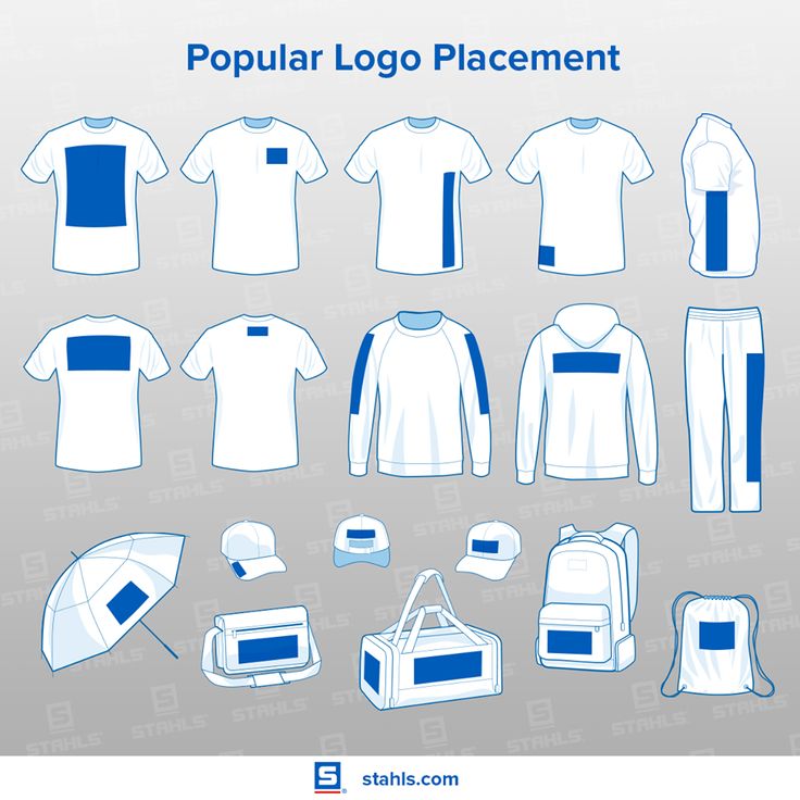
Merchandise placement considers product function and aesthetics. Apparel positioning (chest, sleeve, back); promotional item placement; and packaging integration. Product-appropriate placement.
Common Placement Errors
Too many logos dilute impact. Logo repetition within single application; competing organizational marks; and cluttered composition. Restraint required.
Inconsistent placement across materials fragments identity. Different positions on different materials; varying sizes without system; and arbitrary decisions. Systematic approach needed.
Poor integration with design creates amateur appearance. Logo appearing stuck-on rather than designed-in; clashing with aesthetic; and inappropriate scale. Professional integration essential.
Obscured or compromised placement wastes logo investment. Placement where folds, binding, or other elements interfere; insufficient contrast; and awkward positioning. Practical verification necessary.
Luna Graphics provides logo application guidelines and implementation support ensuring optimal placement across all touchpoints. We help brands maintain professional presence through correct logo implementation. Contact our design team for placement optimization.
Written by Ian Love
Marketing Director
Professional contributor at Luna Graphics specializing in printing and branding solutions.