
The Color Accuracy Challenge
Color accuracy represents the most frequent quality concern in large format printing. Clients expect brand colors to match across different materials, printing technologies, and production runs. Achieving this consistency requires understanding color science, device calibration, and material interactions affecting final appearance.
Large format color management faces unique challenges: diverse substrates (vinyl, fabric, rigid boards) with different color behaviors; wide-gamut ink sets varying by technology (solvent, latex, UV); environmental viewing conditions affecting perception; and the scale making color variations more noticeable than in small formats.
Color Science Fundamentals
Color models: RGB (additive, for screens); CMYK (subtractive, for printing); and Lab (device-independent, for translation). Large format printing uses CMYK plus additional colors (light cyan, light magenta, orange, violet) expanding gamut.
Gamut limitations mean some colors (bright oranges, deep blues, neon greens) are unachievable in print. Gamut mapping compresses out-of-gamut colors to printable equivalents, inevitably losing some vibrancy.
Metamerism describes colors matching under one light source but diverging under another. This phenomenon particularly affects proofing—monitor-to-print matches under office lighting may mismatch in daylight or store environments.
Color Management Workflow
ICC profiles characterize device behavior: input (scanners, cameras); display (monitors); and output (printers). Profiles enable color translation between devices, maintaining appearance consistency.
Monitor calibration using spectrophotometers ensures accurate soft-proofing. Calibration establishes: white point (typically D65); gamma (2.2 for Windows, 1.8 for Mac); and luminance (120 cd/m² typical).
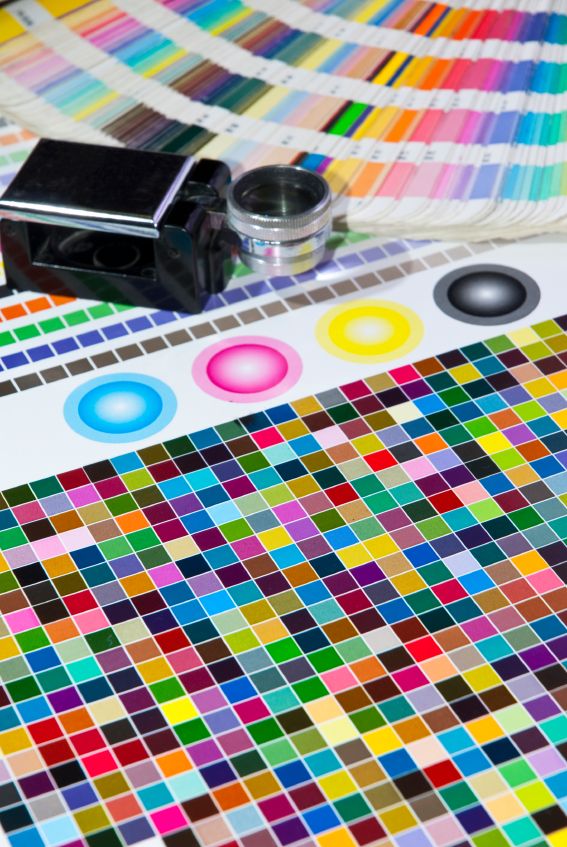
Printer profiling creates device-specific characterization. Printed color patches are measured, creating profiles mapping file colors to ink combinations producing desired appearance. Profiles are substrate-specific—vinyl, fabric, and paper require separate profiles.
Proofing and Verification
Soft proofing simulates output on calibrated monitors using printer profiles. This catches major color issues before production but cannot predict substrate effects or environmental viewing.
Hard proofing (press proofs) produces actual printed samples for approval. Methods include: reduced-scale proofs on target material; color patches showing critical brand colors; and full-size sections for large critical projects.
Spot color matching uses spectrophotometers comparing printed output to Pantone or brand standards. Delta E measurements quantify color difference—under 2.0 generally considered acceptable match.
Material Effects on Color
Substrate color affects output—printing on yellow-tinted vinyl versus white produces different results. Color management compensates but cannot overcome extreme substrate tinting.
Surface texture influences appearance—glossy surfaces appear more vibrant than matte; textured materials scatter light reducing saturation. Viewing angle affects gloss perception.
Opacity and backing affect color on transparent or translucent materials. White ink backing may be necessary for color accuracy on colored or clear substrates.
Achieving Consistency
Standardized lighting (D50 or D65) for evaluation eliminates metamerism issues. Viewing booths provide controlled conditions for color assessment.
Process control includes: daily printer calibration; substrate lot consistency; ink batch tracking; and environmental monitoring (temperature, humidity).
Brand color libraries establish master references. Physical standards (Pantone chips, printed samples) provide objective targets beyond digital files.
Large Format Specific Considerations
Scale effects—color variations visible across large prints that would be imperceptible in small formats. Banding, mottle, and uniformity issues become apparent at size.
Multiple printer matching requires cross-calibration ensuring different devices produce identical output. Critical for large projects exceeding single printer capacity.
Installation environment affects final appearance—outdoor graphics viewed in direct sun appear different than indoor evaluation; night viewing of backlit graphics requires different color optimization.
Luna Graphics maintains ISO-standard color management protocols ensuring predictable, accurate output. Our spectrophotometric verification and proofing services provide color confidence for brand-critical projects. Contact our color management specialists for demanding color requirements.
Written by Ian Love
Marketing Director
Professional contributor at Luna Graphics specializing in printing and branding solutions.